The Birth of a Logo
Every successful organization wants a memorable logo to call their own. Far more than just a pretty sketch, a good logo should be imbued with meaning. A symbol designed to captivate so quickly that it lures a new member within seconds of seeing it. Touching the psyche with such precision that the viewer is taken aback by the image before they realize it.
That is precisely what Nicole Bloss was hired for.
Meeting the Crew
When Nicole Bloss met Jack Rubinson, it was while camping with the East Bay Burners back in 2017. The camaraderie was instantaneous. Always ready to lend a helping hand, new friends and old gathered together to celebrate friendship and radical self-expression. Almost everyone ready and willing to share their resources so everyone felt safe to connect with one another. It was a unique and glorious experience. And though they enjoyed learning much about each other and their shared love of the playa, they didn’t actually reconnected until Spring 2020, when the whole world was placed on an indefinite hold.
It was during the early months of the shutdown when Burning Hearth truly began to take shape. And as Jack and former co-founder, Dennis Domondon, continued to look for volunteers to help their fellow burners in-need, he decided to ask that very community for help to design a logo for the newly established Burning Hearth. And while there were several designs he liked, when Nicole offered her skills as a professional graphic designer, there was nothing more to be said.
The Hearth was in need of a symbol, and Nicole answered the call.
A Perfect Conjuring
Although the staff of Burning Hearth collectively recommended that the new logo should look something like the “fire and ice” fan art that Jack had displayed at their camp back Home, Nicole elected to try a more personal approach. As an seasoned expert in her field, she began her work by taking a deeper look into the concept of “the Hearth” itself. About two months into California’s statewide quarantine, Nicole packed a bag and left her city to visit Jack at his home in Truckee so she could more effectively focus on her new commission, in addition to her other assignments. The newly formed crew wanted the symbol to be somewhat reminiscent of the Man itself, but she knew that the Burning Man Project was firmly against endorsing any clubs they didn’t run for themselves. After about a week of research and design, Ms. Bloss found what she was looking for.
While she spent a good amount of time researching a variety of Greek and Roman goddesses for inspiration, the answer soon became clear as day. Hestia. The Greek goddess, Hestia. Quite literally the goddess of the hearth! The moment Nicole realized this… the moment she found her…. it was like being struck by lightning. So perfect a realization, she found herself grinning with joy at the thought of such perfection. Once she overcame the shock of it all, Nicole made herself a cocktail, sharpened her pencils, and went to work.
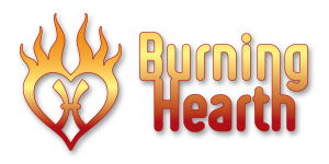
Beginning with Hestia’s symbol as a base – ancient, centered, and strong – she designed the logo to fit completely around it; echoing the spirit of Hestia in the very center of her design. Then, she incorporated the heart. This shape quickly conveys feelings of warmth and welcome – which are perfectly aligned with the soul of this once widely beloved ancient goddess. Finally, she wrapped it all up in colors and gestures that mirrored elements of fire. This would represent the physical hearth as it appears on the playa or in the midst of a camp.
In the end, it all fell together like pieces of a well-loved jigsaw puzzle. And once done, there was nothing left to do but sit back and gaze with pride and admiration at the simple, yet multifaceted work of art she just created. The delicate combination of lines, color, and flame, culminating together on the paper with sheer perfection.
The symbol for the Hearth was born.

Looking Ahead
As burners all over the world continue to wait with baited breath to hear if our beloved Home will welcome us back this year, Burning Hearth stands at the ready. With such a perfect symbol to use on their masks and marketing campaigns, it is now up to the crew to make the best use of Nicole’s beautifully crafted design.
Burning Hearth hopes to inspire burners everywhere to build, grow, and serve each other at every opportunity. And though they have much to learn about building new connections outside their existing community, one thing is absolutely certain: That they are interested in helping all lives. Every life. Hoping to focus on love and healing and warmth and hope for every burner they happen to meet.
The Hearth is ready and willing to serve.


Leave A Comment